01
Start with the note you send most
Before browsing designs, write down five notes you have sent—or genuinely meant to send—in the past year. Mark who each note was for, why you wrote, and roughly how much space the message needed. That small inventory is a better buying guide than an aspirational mood board.
If most messages are a focused thank-you or a brief follow-up, a flat correspondence card removes the pressure to fill a page. If you naturally add a story, context, or several paragraphs, a folded note or letter sheet will feel less cramped.
- Short thank-yous and professional follow-ups: begin with flat cards
- Congratulations, sympathy, and more private messages: consider folded notes
- Pen-pal letters and longer correspondence: choose letter sheets with matching envelopes
- Mixed habits: buy a small first run instead of forcing one format to do every job
02
Flat cards, folded notes, and letter sheets do different jobs
A flat correspondence card is one sturdy panel. It feels direct, modern, and complete after a few thoughtful lines. A folded note separates the design on the front from the message inside, adding privacy and more room without becoming a full letter.
Letter sheets are the better choice when writing is the main event. They give longer thoughts room to breathe and fold into an envelope without asking heavy card stock to bend. None of the formats is universally better; the right one is the format that matches your normal message length.
03
Choose personalization that can survive real life
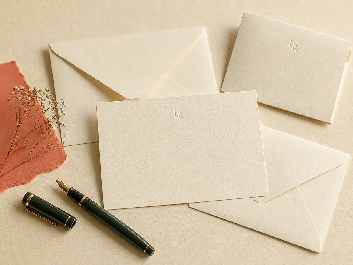
A first name or full name is usually the most flexible choice for everyday stationery. A monogram can feel more formal or decorative, but its letter order and meaning vary by style. Never assume the preview is correct simply because the initials were entered correctly—read the finished arrangement as carefully as an address.
Return-address printing saves time, but it also ties the envelopes to one home. That can be perfect for a settled household and inconvenient for a renter, student, newlywed, or anyone likely to move before using the full set.
04
Make the paper work with your real pen
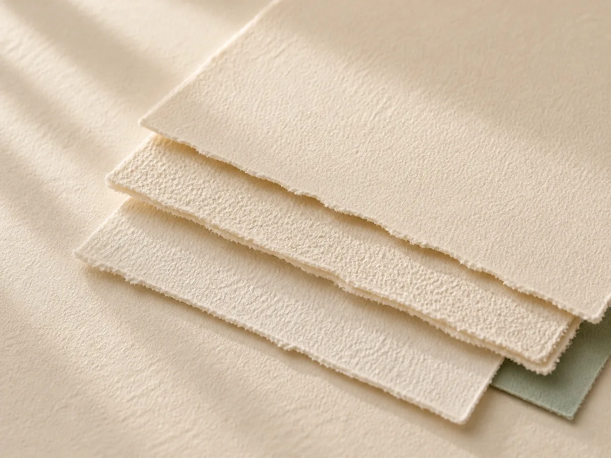
The card has to be pleasant to write on, not merely impressive to hold. Look for a clearly described paper stock and finish, a generous uncoated writing area, and close photographs that show texture. If samples are available, test the pen you use most rather than a pen chosen for the product photo.
Thicker is not automatically better, and paper-weight numbers are only easy to compare when sellers use the same measurement system. A clean, compatible writing surface and a card that fits comfortably in its envelope matter more than chasing the largest number on the page.
- Ballpoint and gel users: check for a smooth writing area and reasonable dry time
- Fountain-pen users: look for specific writing-performance details or request a sample
- Left-handed writers: favor a layout that leaves room for your hand and an ink that dries predictably
- Gift buyers: choose versatility unless you know the recipient’s usual pen and paper preferences
05
Treat the envelopes as half the purchase
The envelope is the first part the recipient sees and the part that has to survive the mail. Confirm that envelopes are included, that the card slides in without bowing, and that the color and finish still leave the delivery address easy to read.
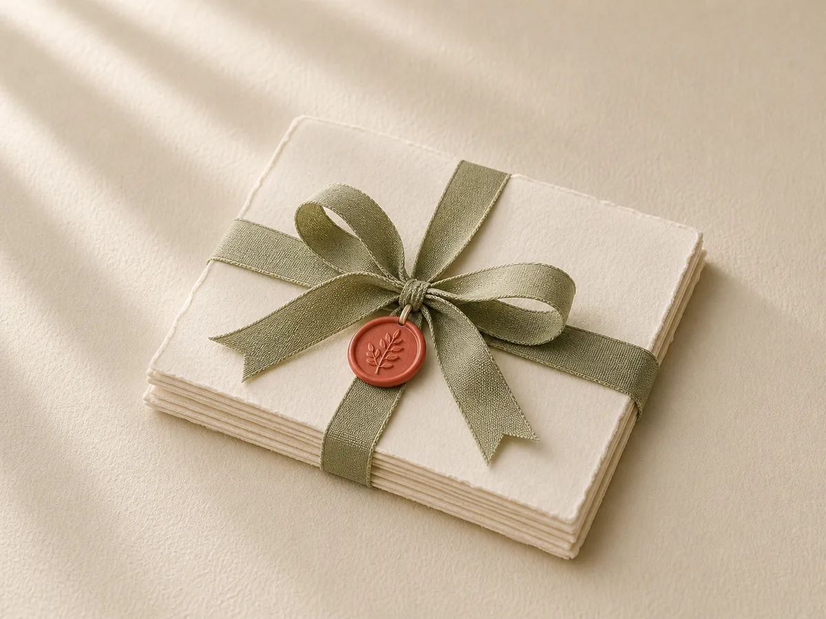
Envelope liners, return addressing, and colored stock can be useful upgrades, but each one adds cost or narrows flexibility. If you plan to add photos, wax seals, or other enclosures, judge postage and thickness from one completed sample—not from the empty stationery set.
06
Choose the printing effect, not the prestige word
Digital printing supports color and detailed artwork. Raised print gives lettering a tactile surface. Embossing presses a design into the paper without needing ink, while foil adds a reflective accent. Each process changes the look and feel, but none can rescue a format that is awkward to write on.
For a first set, one name or monogram, one restrained color, and plenty of blank writing space usually stay useful longer than a highly specific occasion design. Let the handwritten message remain the most important mark on the card.
07
Approve the order like a proofreader
Personalized orders may have tighter cancellation or return rules than ordinary stationery. Before paying, review the live policy, delivery estimate, proof process, envelope count, and reorder options. Then check every letter, punctuation mark, line break, and address in the final preview.
Start with the smallest sensible quantity when trying a new format or supplier. A first box is a real-world test: you will learn whether the card invites the right amount of writing, whether your pen behaves, and whether you reach for the set without hesitation.